How to Visualize Trends with Business Intelligence Software: A Guide to Data-Driven Decisions
In today’s data-saturated world, businesses are drowning in information. However, raw data alone is useless. The true power lies in understanding the trends hidden within. This understanding empowers informed decision-making. This is where business intelligence (BI) software becomes crucial. It transforms complex data into easily digestible visuals. These visuals reveal critical insights. This article explores how to visualize trends with business intelligence software. It guides you through the process of leveraging data for strategic advantage.
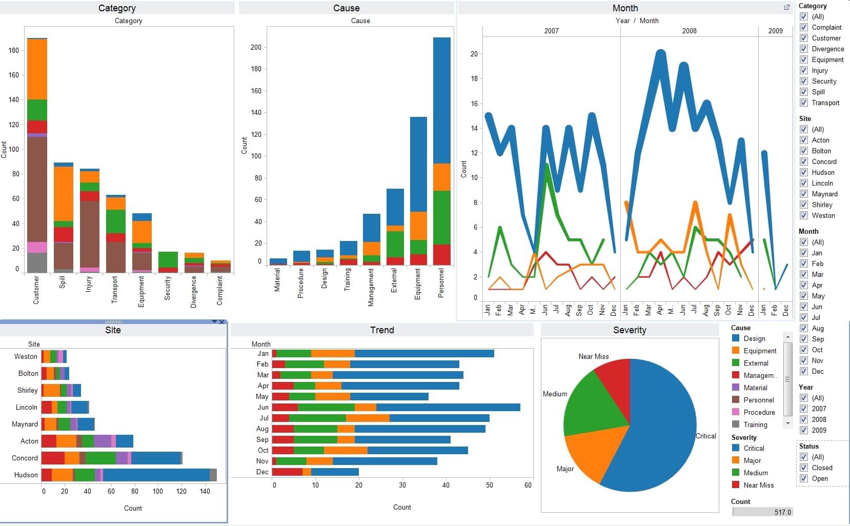
The core function of BI software is data visualization. It presents data in charts, graphs, and dashboards. These visuals offer a clear view of performance. They highlight patterns, anomalies, and opportunities. This is essential for making data-driven decisions. The ability to spot trends quickly is a key benefit. It allows for proactive adjustments and strategic planning. This is a crucial element of modern business.
The Importance of Data Visualization
Data visualization is not just about pretty charts. It is a vital tool. It helps to understand complex information. It makes data accessible to everyone. Effective visualizations can significantly improve decision-making. They reduce the risk of relying on gut feelings. Instead, they use evidence-based insights. This leads to more effective strategies. It also improves operational efficiency.
Consider the following benefits of data visualization:
- Improved Comprehension: Visuals simplify complex data. They make it easier to grasp key trends.
- Faster Insights: Charts and graphs allow for quick identification of patterns. This saves time and improves responsiveness.
- Enhanced Communication: Visuals communicate insights more effectively. They are easier to share and understand across teams.
- Data-Driven Decisions: Visualization enables informed decision-making. It reduces reliance on intuition and assumptions.
- Increased Efficiency: Visualizations identify inefficiencies. They highlight areas for improvement.
Choosing the Right Business Intelligence Software
Selecting the right BI software is a critical step. The ideal solution depends on your specific needs. Consider factors like data sources, budget, and technical expertise. Several leading BI platforms offer robust visualization capabilities.
Here are some popular options:
- Tableau: Known for its intuitive interface and powerful visualization features.
- Microsoft Power BI: Offers a comprehensive suite of tools. It integrates seamlessly with other Microsoft products.
- QlikView: Focuses on data discovery and self-service BI.
- Looker: A cloud-based platform. It emphasizes data governance and collaboration.
Each platform has strengths and weaknesses. Evaluate them based on your requirements. Consider trial periods to test the software. Ensure it meets your needs for visualizing trends with business intelligence software.
Preparing Your Data for Visualization
Before you can visualize trends, you need to prepare your data. This involves several steps. These steps ensure accuracy and consistency. Poor data quality leads to misleading insights. This undermines the value of the entire process.
Here’s a breakdown of the data preparation process:
- Data Collection: Gather data from all relevant sources. This may include databases, spreadsheets, and cloud services.
- Data Cleaning: Remove errors, inconsistencies, and duplicates. This ensures data accuracy.
- Data Transformation: Convert data into a usable format. This may involve calculations and aggregations.
- Data Loading: Load the prepared data into your BI software. This makes it accessible for analysis.
Investing time in data preparation is crucial. It ensures that your visualizations are reliable. It also leads to trustworthy insights. This is essential for visualizing trends with business intelligence software.
Creating Effective Visualizations
Once your data is ready, it is time to create visualizations. The choice of visualization type depends on the data and the insights you want to convey. Some common visualization types include:
- Line Charts: Ideal for showing trends over time.
- Bar Charts: Useful for comparing different categories.
- Pie Charts: Display proportions of a whole.
- Scatter Plots: Show relationships between two variables.
- Heatmaps: Represent data using color-coded matrices.
When creating visualizations, consider these best practices:
- Choose the Right Chart Type: Select the chart that best represents your data.
- Keep it Simple: Avoid clutter. Ensure your visuals are easy to understand.
- Use Clear Labels: Label axes, titles, and data points accurately.
- Use Color Strategically: Use color to highlight key information.
- Tell a Story: Your visualizations should convey a clear message.
Following these guidelines will enhance your ability to visualize trends with business intelligence software.
Analyzing and Interpreting Trends
Creating visualizations is only the first step. The real value lies in analyzing and interpreting the trends. This involves identifying patterns, anomalies, and correlations. It also requires drawing meaningful conclusions. These conclusions inform decision-making.
Here’s how to analyze and interpret trends effectively:
- Identify Patterns: Look for recurring trends. These may be increases, decreases, or cyclical behaviors.
- Spot Anomalies: Identify outliers. These are data points that deviate significantly from the norm.
- Analyze Relationships: Examine correlations between different variables. This reveals underlying causes.
- Draw Conclusions: Based on your analysis, draw conclusions. These conclusions should inform your decisions.
- Test Hypotheses: Use data to test your assumptions. This ensures your decisions are data-driven.
Effective trend analysis unlocks the power of your data. It enables you to make informed decisions. It is a key benefit of visualizing trends with business intelligence software.
Applying Insights to Drive Decisions
The ultimate goal of visualizing trends is to drive better decisions. Your analysis should inform your actions. Use the insights gained to improve performance. This can involve optimizing processes, identifying new opportunities, and mitigating risks.
Here’s how to apply your insights:
- Set Goals: Define specific, measurable, achievable, relevant, and time-bound (SMART) goals.
- Develop Strategies: Create strategies to achieve your goals. These strategies should be data-driven.
- Implement Actions: Take the necessary actions. These actions should be based on your insights.
- Monitor Results: Track your progress. Use your BI software to monitor your performance.
- Iterate and Improve: Continuously refine your strategies. Use data to improve your outcomes.
By acting on your insights, you can unlock significant value. You can improve your business performance. This is the ultimate payoff of visualizing trends with business intelligence software.
Real-World Examples of Trend Visualization
Let’s look at some real-world examples. These examples demonstrate the power of trend visualization. They showcase how businesses use BI software.
- Sales Analysis: Visualize sales trends over time. Identify top-performing products and sales regions.
- Marketing Performance: Track website traffic, conversion rates, and customer acquisition costs.
- Customer Behavior: Analyze customer churn rates. Understand customer lifetime value.
- Financial Reporting: Monitor revenue, expenses, and profitability. Track key financial metrics.
- Supply Chain Management: Track inventory levels. Identify potential bottlenecks.
These examples highlight the versatility of BI software. They demonstrate its ability to reveal valuable insights. They also reveal its impact across various business functions. These examples emphasize the importance of visualizing trends with business intelligence software.
Common Challenges and How to Overcome Them
While BI software is powerful, challenges exist. These challenges can hinder your success. Addressing these challenges requires careful planning and execution.
Here are some common challenges and how to overcome them:
- Data Quality Issues: Implement data cleaning processes. This ensures data accuracy and consistency.
- Complexity of Data: Simplify your visualizations. Focus on the most important insights.
- Lack of Data Literacy: Provide training to your team. This will improve data understanding.
- Resistance to Change: Communicate the benefits of data-driven decisions. Encourage data-driven culture.
- Integration Challenges: Choose a BI platform that integrates well with your existing systems.
By addressing these challenges, you can maximize the benefits of your BI software. You will also improve your ability to visualize trends. This will support better decision-making.
The Future of Business Intelligence and Trend Visualization
The field of BI is constantly evolving. New technologies and trends are emerging. These will shape the future of trend visualization. Staying informed about these developments is crucial.
Here are some key trends to watch:
- Artificial Intelligence (AI): AI is automating data analysis. It provides deeper insights.
- Machine Learning (ML): ML is used for predictive analytics. It forecasts future trends.
- Cloud-Based BI: Cloud solutions offer greater flexibility and scalability.
- Self-Service BI: Empowering business users with data analysis tools.
- Data Storytelling: Communicating insights through compelling narratives.
Embracing these trends will enhance your ability to visualize trends. It will also ensure your business remains competitive. This is a future-proof strategy for visualizing trends with business intelligence software.
Conclusion: Harnessing the Power of Data
How to visualize trends with business intelligence software is a critical skill. It is essential for success in today’s data-driven landscape. By understanding the principles of data visualization, you can transform raw data into actionable insights. This enables informed decision-making. It drives better business outcomes.
Remember to choose the right software, prepare your data carefully. Create effective visualizations, and analyze trends. Apply your insights to drive strategic decisions. Embrace the latest trends in BI. This will ensure you stay ahead of the curve. By mastering these techniques, you can unlock the full power of your data. You can also make data-driven decisions. This will ultimately lead to sustained success.
[See also: Data-Driven Decision Making: Best Practices and Tools]
[See also: The Role of Data Visualization in Strategic Planning]
[See also: Choosing the Right BI Software for Your Business]

