Unveiling Insights: A Guide to Presenting Data Effectively with Business Intelligence Software
In today’s data-driven world, the ability to transform raw information into actionable insights is paramount. Organizations across industries are leveraging business intelligence (BI) software to analyze complex datasets and make informed decisions. However, the true value of BI lies not just in the analysis but also in the presentation of the findings. This article delves into the art of presenting data effectively using business intelligence software, equipping you with the knowledge to communicate your insights clearly and persuasively.
The core challenge lies in translating complex data into easily digestible formats. This requires careful consideration of your audience, the story you want to tell, and the most appropriate visualization techniques. Effective data presentation is about clarity, accuracy, and impact. It’s about empowering your audience to understand the ‘so what?’ of the data, leading to better decision-making and strategic alignment. Failure to present data effectively can lead to misinterpretations, missed opportunities, and ultimately, flawed business strategies. Therefore, mastering the art of data presentation is crucial for anyone working with business intelligence software.
Understanding Your Audience and Objectives
Before diving into any data presentation, consider your audience. Who are they? What is their existing knowledge of the topic? What are their key priorities? Tailoring your presentation to your audience’s needs is crucial for ensuring that your message resonates. For example, a presentation for the executive team will likely require a high-level overview with key performance indicators (KPIs). In contrast, a presentation for data analysts might involve more granular details and complex visualizations. Understanding your audience informs your choice of data, visualizations, and the overall narrative.
Define your objectives. What do you want your audience to take away from your presentation? What actions do you want them to take? Clearly defined objectives will guide your data selection, analysis, and presentation. Are you trying to highlight a trend, identify a problem, or propose a solution? Your objectives will shape the story you tell with your data. Aligning your presentation with specific, measurable, achievable, relevant, and time-bound (SMART) goals will ensure its effectiveness. Remember, the purpose of using business intelligence software is to achieve specific business goals.
Choosing the Right Business Intelligence Software
The market offers a wide array of business intelligence software solutions. Each tool has its strengths and weaknesses. Selecting the right software is essential for effective data presentation. Consider factors such as ease of use, data integration capabilities, visualization options, and collaboration features. Some popular choices include Tableau, Power BI, Qlik Sense, and Looker. Evaluate each software’s suitability based on your specific needs and technical expertise. A good business intelligence software should allow for creating interactive dashboards and reports.
Evaluate the software’s capabilities. Can it connect to your existing data sources? Does it offer the visualizations you need? Does it support the level of interactivity required for your audience? Some software excels at specific types of visualizations, like geospatial data or time-series analysis. Some offer robust data governance features. Selecting the right business intelligence software is the first step toward presenting data effectively.
Mastering Data Visualization Techniques
Data visualization is the cornerstone of effective data presentation. Choosing the right visualization is critical for conveying your message clearly and concisely. Different chart types are suitable for different purposes. For example, bar charts are excellent for comparing categories, line charts are ideal for showing trends over time, and scatter plots are useful for identifying relationships between variables. Pie charts should be used sparingly and only when representing parts of a whole with a limited number of categories. A good business intelligence software will provide a variety of visualization options.
Consider these best practices for data visualization:
- Keep it simple: Avoid clutter and unnecessary elements.
- Use clear labels and titles: Ensure your audience understands the data.
- Choose appropriate colors: Use color strategically to highlight key information. Avoid using too many colors.
- Provide context: Include relevant background information and explanations.
- Use interactive elements: Allow users to explore the data further.
By applying these principles, you can transform complex data into compelling visuals that drive understanding and action. Business intelligence software is designed to assist with all these aspects.
Crafting a Compelling Data Story
Presenting data is not just about showing charts and graphs. It’s about telling a story. A well-crafted data story connects the dots, provides context, and highlights the key takeaways. Start by identifying the main narrative. What is the central message you want to convey? What is the ‘so what?’ for your audience? Structure your presentation logically. Organize your data in a way that supports your narrative. Use a clear beginning, middle, and end. Each visualization should contribute to the overall story.
Use data to support your arguments. Back up your claims with evidence. Highlight key trends, patterns, and insights. Provide context by explaining the significance of the data. Explain the ‘why’ behind the numbers. Use annotations, callouts, and other visual cues to draw attention to important points. A good data story will engage your audience and leave a lasting impact. This is a key benefit of using business intelligence software.
Building Interactive Dashboards and Reports
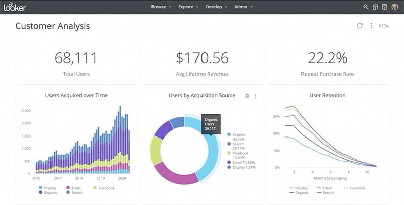
Interactive dashboards and reports are powerful tools for data exploration and analysis. They allow users to interact with the data, filter information, and drill down into details. When designing interactive dashboards, consider the following:
- User experience: Design the dashboard with the user in mind. Make it intuitive and easy to navigate.
- Key performance indicators (KPIs): Display the most important metrics prominently.
- Filters and drill-downs: Allow users to explore the data at different levels of detail.
- Real-time data: Ensure the dashboard is updated with the latest information.
- Mobile optimization: Design the dashboard to be accessible on various devices.
Interactive dashboards empower users to answer their own questions and gain deeper insights. They foster a culture of data-driven decision-making. Effective business intelligence software allows for the creation of such dashboards.
Best Practices for Effective Presentation
Beyond the technical aspects of data visualization, consider these best practices for effective presentation:
- Practice your presentation: Rehearse your delivery to ensure a smooth and confident presentation.
- Know your data: Be prepared to answer questions and provide context.
- Keep it concise: Avoid overwhelming your audience with too much information.
- Engage your audience: Ask questions, encourage discussion, and make it interactive.
- Use visual aids: Incorporate charts, graphs, and other visuals to support your message.
- Provide a clear call to action: Tell your audience what you want them to do.
Following these guidelines will enhance your ability to communicate your insights persuasively. Remember that the goal is to inform, persuade, and drive action. A comprehensive business intelligence software solution will allow you to create such presentations.
Leveraging Business Intelligence Software for Specific Use Cases
The application of business intelligence software extends across various industries and use cases. For instance, in retail, BI can be used to analyze sales data, customer behavior, and inventory levels. This analysis helps in optimizing product placement, managing promotions, and improving customer satisfaction. In healthcare, BI tools can analyze patient data to identify trends, improve treatment outcomes, and manage resources efficiently. Financial institutions use BI to monitor market trends, assess risk, and detect fraud. These are just a few examples of how business intelligence software can be used effectively.
Consider these specific examples:
- Sales Analysis: Track sales performance, identify top-performing products, and analyze sales trends.
- Marketing Analytics: Measure campaign effectiveness, analyze customer behavior, and optimize marketing spend.
- Financial Reporting: Generate financial statements, track key financial metrics, and identify areas for improvement.
- Supply Chain Optimization: Analyze supply chain performance, identify bottlenecks, and improve efficiency.
Each industry has its unique requirements. Adapting the use of business intelligence software requires understanding these unique needs.
Continuous Improvement and Iteration
Data presentation is not a one-time event. It’s an ongoing process of learning and improvement. Continuously gather feedback from your audience. What did they find most helpful? What could be improved? Use this feedback to refine your presentations and visualizations. Stay up-to-date with the latest trends and best practices in data visualization and business intelligence software. The field is constantly evolving. Experiment with new techniques and tools. Embrace a culture of continuous improvement to ensure that your data presentations remain effective and impactful. This continuous learning process will help you maximize the value of your business intelligence software investment.
Conclusion
Presenting data effectively is a critical skill in today’s data-driven world. By understanding your audience, choosing the right tools, mastering data visualization techniques, and crafting compelling data stories, you can transform raw data into actionable insights. Mastering the art of data presentation is essential for anyone working with business intelligence software. Embrace the power of data to drive informed decisions and achieve your business objectives. Remember to always prioritize clarity, accuracy, and impact. The effective use of business intelligence software can significantly enhance your ability to achieve these goals.
[See also: Related Article Titles]

