Mastering Data Presentation: A Guide to Effective Business Intelligence Software
In today’s data-driven world, the ability to effectively present data is no longer a luxury, it’s a necessity. Businesses across all industries rely on data to make informed decisions, identify trends, and optimize performance. However, raw data alone is often overwhelming and difficult to interpret. This is where business intelligence (BI) software comes into play, providing the tools to transform complex data into clear, actionable insights. This article provides a comprehensive guide on how to present data with business intelligence software.
The Importance of Data Presentation
Effective data presentation is crucial for several reasons. Firstly, it improves understanding. Complex data can be simplified through visualizations, making it easier for stakeholders to grasp key findings. Secondly, compelling presentations drive decision-making. When data is presented clearly, it enables informed choices, leading to better outcomes. Thirdly, data presentation facilitates communication. Presenting data visually allows for efficient communication across teams, departments, and even with external stakeholders. Finally, it identifies trends and patterns. Business intelligence software helps reveal hidden patterns that might be missed in raw data.
Choosing the Right Business Intelligence Software
Selecting the right business intelligence software is the first step toward effective data presentation. Various options are available, each with its strengths and weaknesses. Consider these factors when making your choice:
- Ease of Use: The software should be user-friendly, with an intuitive interface and minimal learning curve.
- Data Integration: It should seamlessly integrate with your existing data sources, such as databases, spreadsheets, and cloud services.
- Visualization Capabilities: The software should offer a wide range of visualization options, including charts, graphs, dashboards, and maps.
- Reporting Features: It should allow you to generate customizable reports with automated scheduling and distribution options.
- Scalability: The software should be able to handle increasing data volumes and user demands as your business grows.
- Collaboration Features: Look for features that enable collaboration among team members, such as shared dashboards and commenting capabilities.
- Cost: Evaluate pricing models and ensure they align with your budget and needs.
Popular business intelligence software options include Tableau, Power BI, Qlik Sense, and Looker. Each has unique features and capabilities. Evaluate your specific needs and preferences before making a decision.
Data Preparation: The Foundation of Effective Presentation
Before you can present data effectively, you must prepare it properly. Data preparation involves cleaning, transforming, and organizing raw data to ensure accuracy and consistency. This process includes:
- Data Cleaning: Removing errors, inconsistencies, and missing values.
- Data Transformation: Converting data into a suitable format for analysis and visualization.
- Data Aggregation: Summarizing data to provide meaningful insights.
- Data Enrichment: Adding relevant context to your data.
Many business intelligence software solutions offer built-in data preparation tools. These tools simplify the process and help you ensure data quality. Proper data preparation is essential for creating accurate and reliable presentations.
Visualizing Your Data: Best Practices
Choosing the right visualizations is critical for effective data presentation. Different types of charts and graphs are suitable for different types of data and purposes. Here are some best practices:
- Choose the Right Chart Type: Select a chart type that best represents your data and the insights you want to convey. For example, use bar charts to compare categories, line charts to show trends over time, and pie charts to display proportions.
- Keep it Simple: Avoid clutter and distractions. Focus on conveying the most important information clearly and concisely.
- Use Clear Labels and Titles: Label axes, provide chart titles, and use legends to ensure your audience understands your data.
- Use Color Strategically: Use color to highlight key data points, differentiate categories, and draw attention to important insights. Avoid using too many colors, as this can be overwhelming.
- Consider Your Audience: Tailor your visualizations to your audience’s level of understanding and their specific interests.
- Provide Context: Add context to your visualizations by including annotations, comments, and key takeaways.
Business intelligence software provides a wide array of visualization options. Experiment with different types to find what works best for your data and audience.
Creating Effective Dashboards
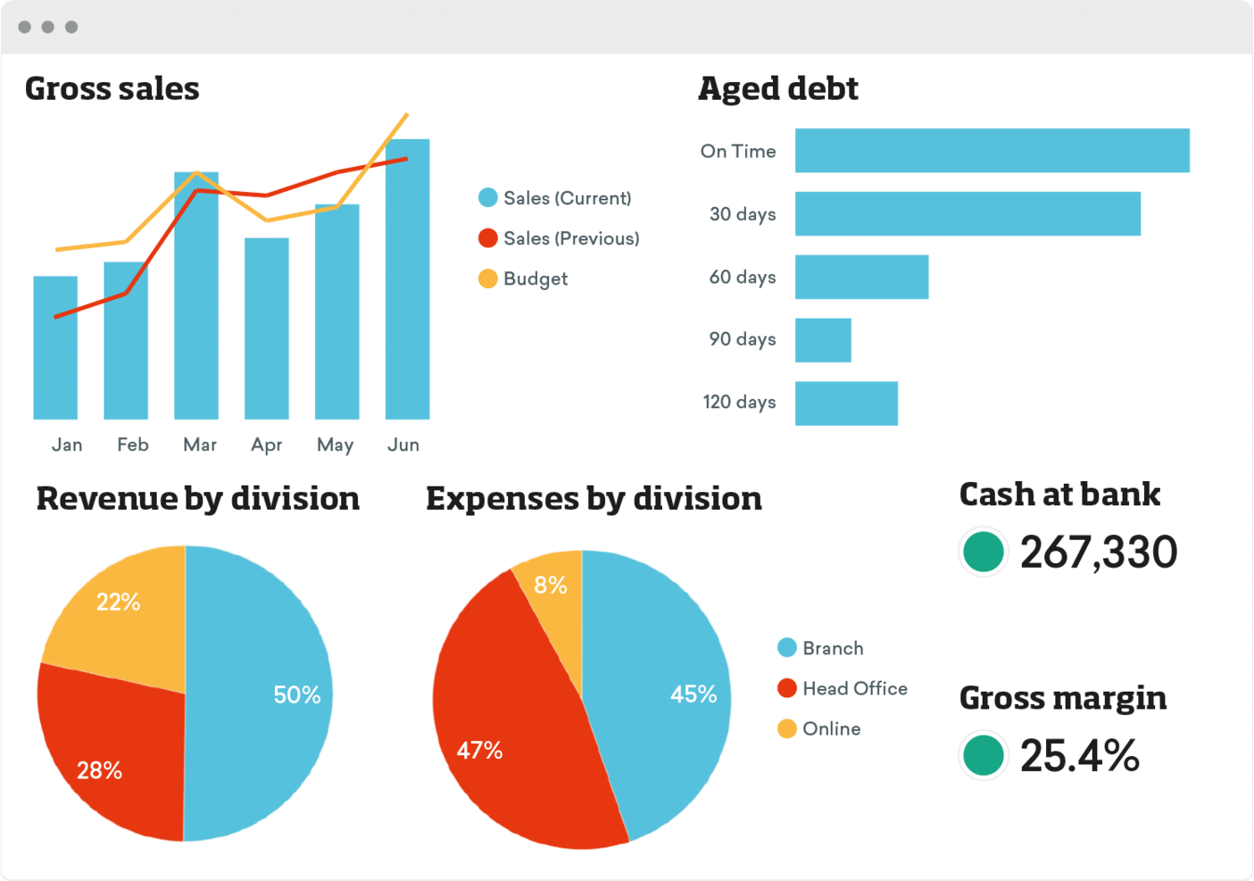
Dashboards are interactive interfaces that provide a comprehensive overview of key performance indicators (KPIs) and other important metrics. They allow users to monitor performance, identify trends, and make data-driven decisions. Here are some tips for creating effective dashboards:
- Define Your Objectives: Determine the goals of your dashboard and the key metrics you want to track.
- Select Relevant Metrics: Choose the most important KPIs that align with your objectives.
- Use a Clear Layout: Organize your dashboard logically, with a clear flow of information.
- Use Visualizations Effectively: Use a variety of charts and graphs to present your data in an engaging and informative way.
- Provide Interactivity: Allow users to filter, drill down, and interact with the data.
- Keep it Updated: Ensure your dashboard is regularly updated with the latest data.
- Test and Iterate: Gather feedback from users and make adjustments to improve the dashboard’s usability and effectiveness.
Business intelligence software makes it easy to create and customize dashboards. Leverage these features to build dashboards that meet your specific needs.
Presenting Your Data: Storytelling with Data
Data presentation goes beyond simply displaying charts and graphs. It also involves storytelling. Presenting data in a narrative format helps your audience understand the context and significance of your findings. Here’s how to tell a story with data:
- Identify Your Audience: Understand your audience’s background, interests, and needs.
- Define Your Key Message: Determine the main point you want to convey.
- Structure Your Presentation: Organize your presentation logically, with a clear beginning, middle, and end.
- Use Visualizations to Support Your Story: Use charts and graphs to illustrate your key points.
- Provide Context and Insights: Explain the significance of your data and provide insights that go beyond the raw numbers.
- Use a Strong Opening and Closing: Capture your audience’s attention with a compelling opening and leave them with a memorable takeaway.
Business intelligence software can help you create compelling presentations that effectively communicate your message. By combining data visualization with storytelling techniques, you can create presentations that resonate with your audience and drive action.
Examples of Data Presentation in Action
Let’s look at some real-world examples of how to present data with business intelligence software:
- Sales Performance Dashboard: A sales team uses a dashboard to track sales revenue, sales volume, and customer acquisition costs. The dashboard uses bar charts to compare sales performance across different regions and line charts to show sales trends over time.
- Marketing Campaign Analysis: A marketing team uses a dashboard to track website traffic, lead generation, and conversion rates. The dashboard uses pie charts to show the distribution of website traffic sources and funnel visualizations to track the customer journey.
- Customer Segmentation Analysis: A business uses a dashboard to segment its customers based on demographics, purchase history, and engagement. The dashboard uses heatmaps and scatter plots to identify customer segments and understand their behavior.
These are just a few examples of how business intelligence software is used to present data. The specific use cases will vary depending on the industry and the business’s specific needs.
Best Practices for Long-Term Success
To ensure long-term success with data presentation, consider these best practices:
- Invest in Training: Provide training to your team members on how to use business intelligence software and how to effectively present data.
- Foster a Data-Driven Culture: Encourage a culture of data-driven decision-making throughout your organization.
- Regularly Review and Refine Your Presentations: Continuously evaluate your data presentations and make improvements based on feedback and changing business needs.
- Stay Up-to-Date: Keep abreast of the latest trends and best practices in data presentation.
- Promote Data Literacy: Educate employees on basic data analysis and data interpretation skills.
By following these best practices, you can ensure that your data presentations remain effective and impactful over time. Business intelligence software is a powerful tool. Using it correctly will result in better outcomes.
Conclusion: Empowering Decisions Through Data
Business intelligence software is an essential tool for transforming raw data into actionable insights. By understanding the principles of data presentation, choosing the right software, and following best practices, businesses can empower their teams to make informed decisions, drive growth, and achieve their goals. Mastering how to present data with business intelligence software is a key skill in today’s competitive landscape. It can significantly improve your business’s performance.
[See also: Data Visualization Techniques for Beginners]
[See also: Choosing the Right BI Tool for Your Business]
[See also: Data Storytelling: Engaging Your Audience with Data]
[See also: Advanced Data Analysis Techniques]

